Personal Rebrand
2025
Make it yours before you make it big.

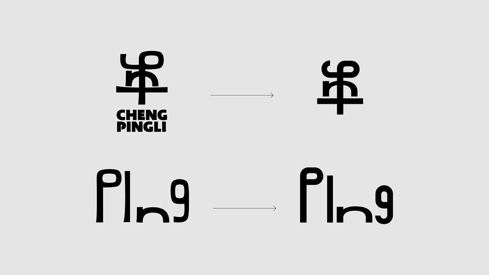
From a symbol to meaningful logo
I used to be called Cheng-Ping (丞平 in Traditional Chinese) in my hometown, it's my birth name given by my parents.
And I've always believed that a person's personality partially comes from their name.
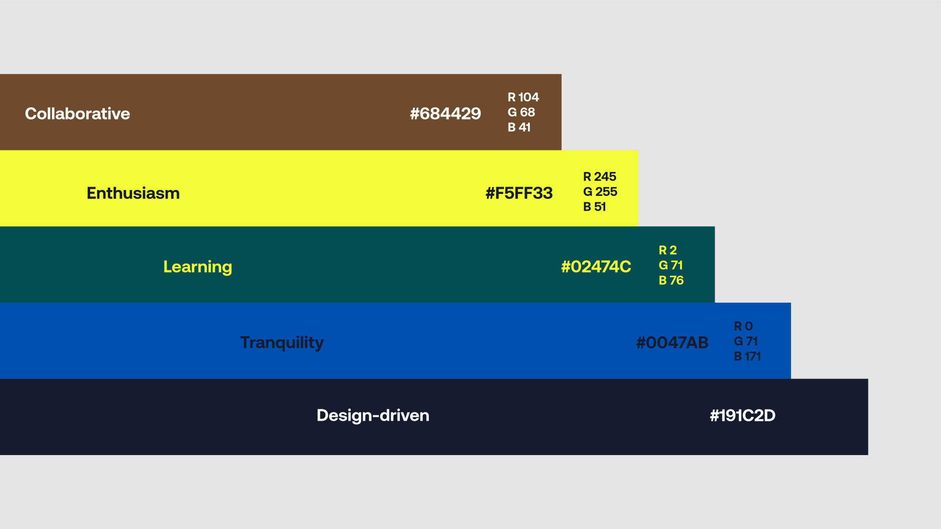
My name represents me as a personal brand, with "Ping" (平) being the iconic character. In Tranditional Chinese, it has multiple meanings, one being "tranquility" or "calm."
I chase this quality in my creative career, as I find myself most productive and focused when I'm in a calm state.
From East to West and across the globe, I want to communicate this concept through my branding and new logo, more than just a symbol. I aim to express myself as a self-taught, continuous learner, challenge taker, creative problem-solver, and collaborator. Most importantly, I bring enthusiasm and joy to everything I do.

Backstory
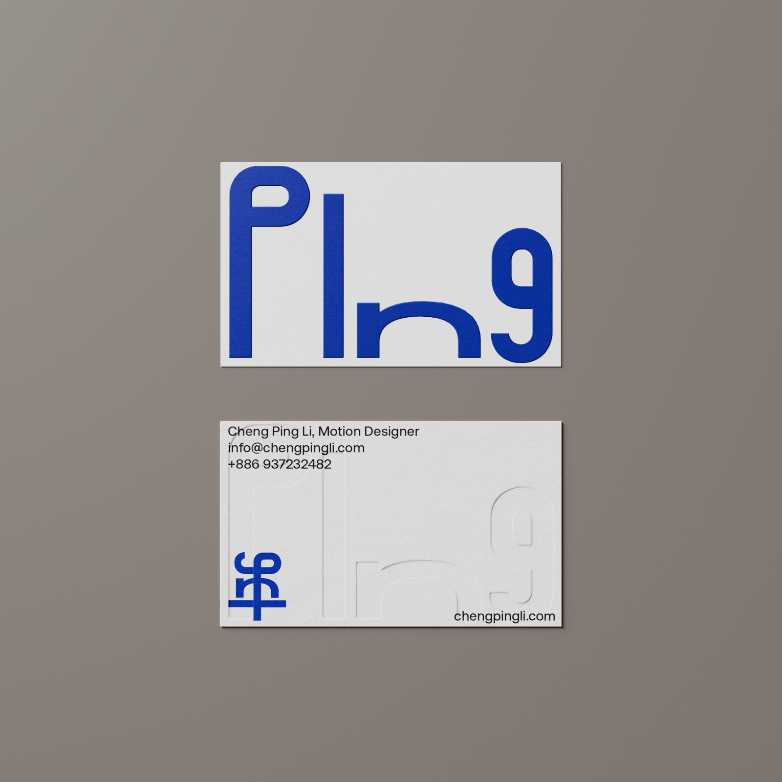
This project started with a simple idea: to combine my traditional Chinese name with its "Pinyin" in English.
The first version came about three years ago. It was more of a quick sketch than a finished design. The core idea felt right, but the execution didn’t reflect the clarity or structure I wanted.
So I decided to start over.
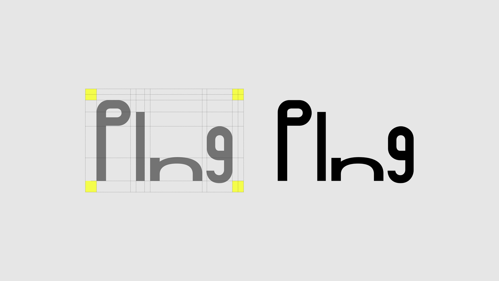
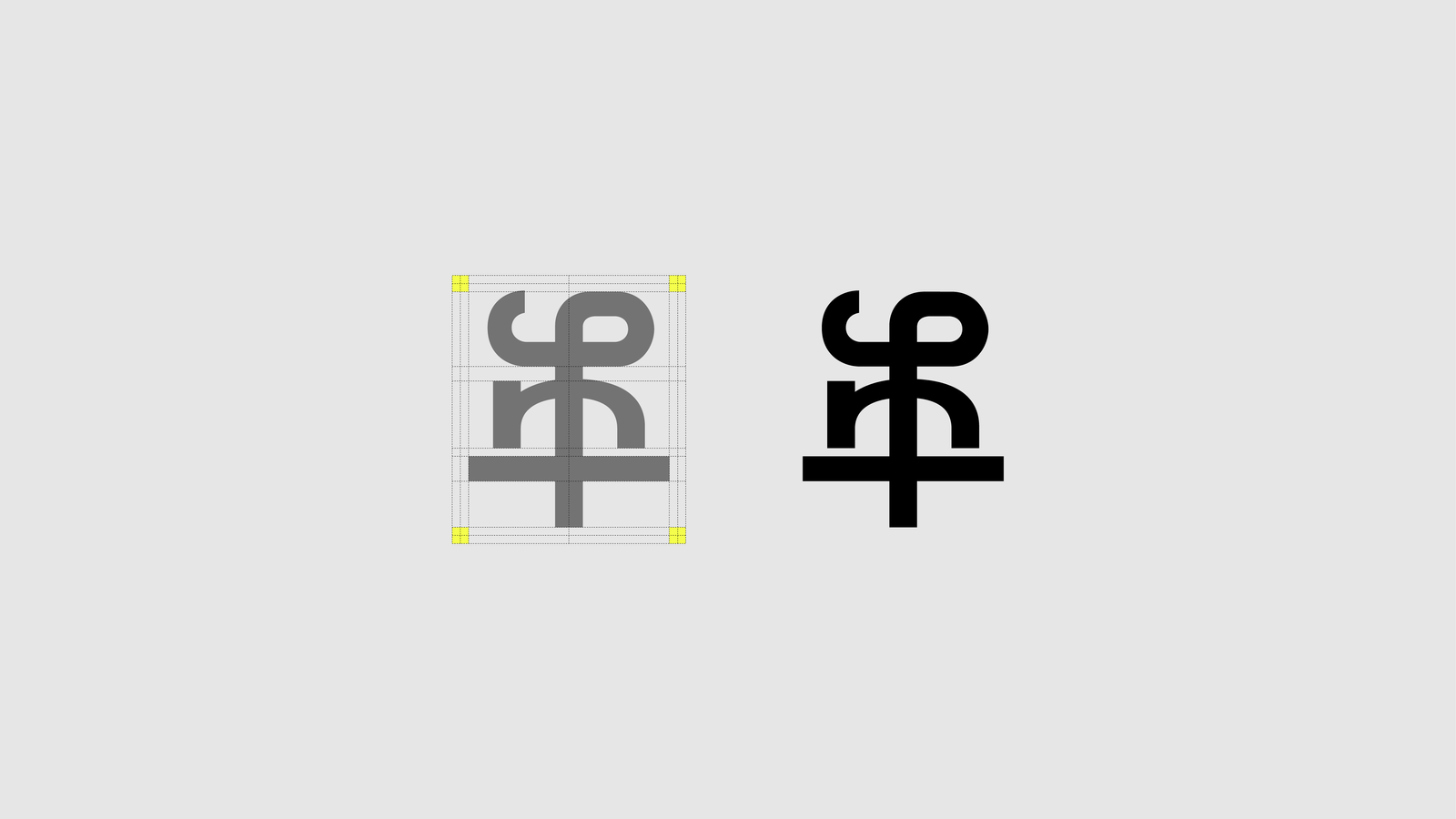
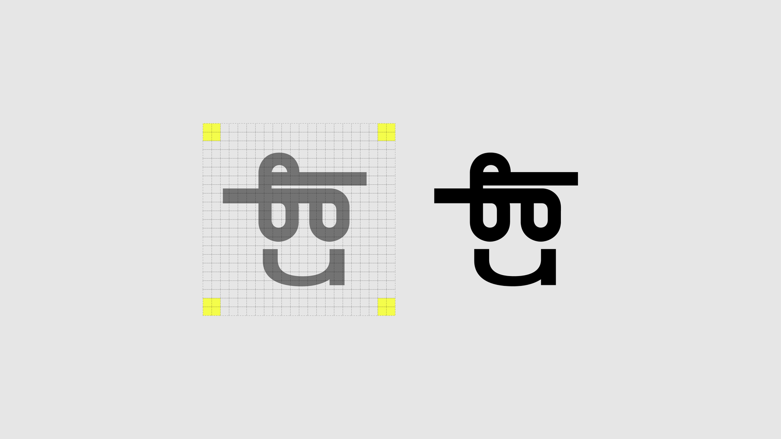
01. Wordmark
Design Process
I kept the same concept, but this time I approached it more seriously. I spent time adjusting the typography, refining the balance between the two writing systems, and making sure the visual weight felt consistent. I focused on how the two parts could feel connected without forcing them to blend unnaturally.
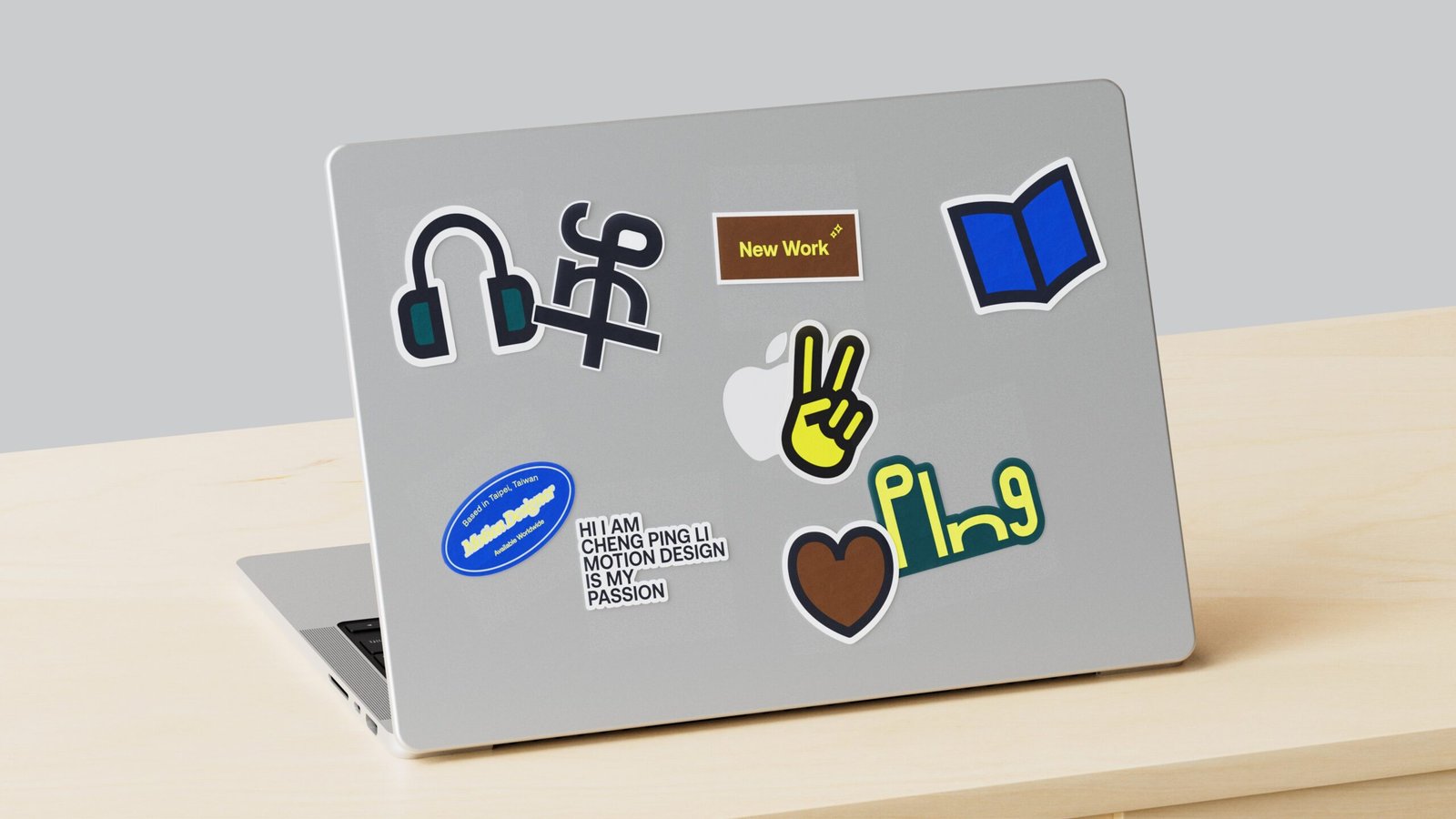
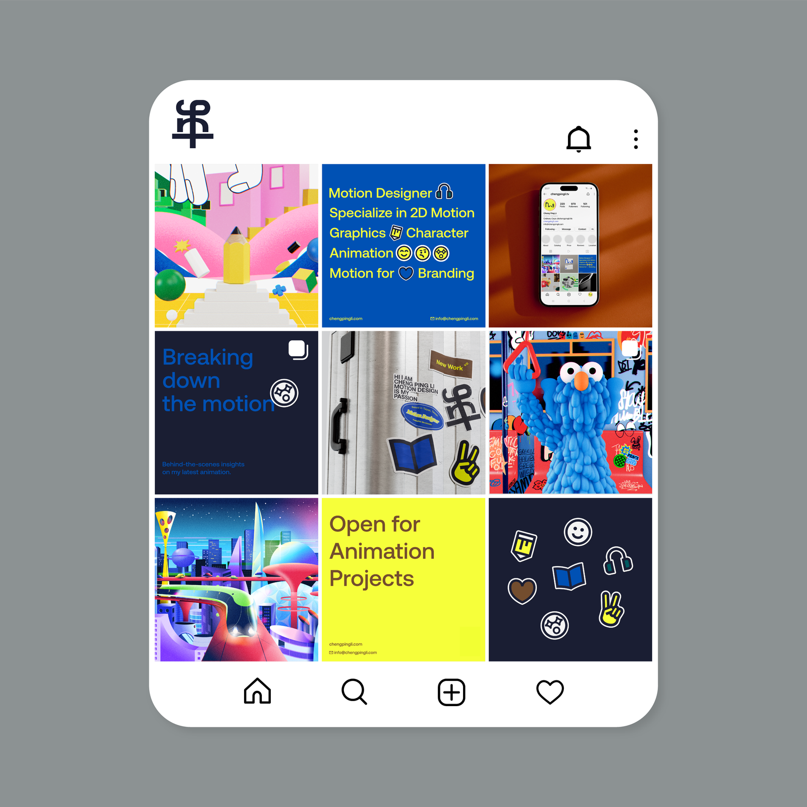
I also explored the color system and selected Aeonik and Marist as the main typefaces. To complement them, I created a few simple icons derived from the font shapes, keeping the overall visual language consistent and flexible.
On the motion side, I experimented with how the logo could behave. It switches between English and Traditional Chinese, and also shifts into a more expressive version that moves from emoji-like symbols to text. This motion logic helps bring the identity to life in a way that feels playful but still aligned with the brand’s tone.
It’s a small personal system. A way of translating identity into form and creating something that works across both static and motion contexts.
02. Typography & Color System
03. Communication

04. Logo Motion Explorations
Credits
Art Director
Cheng Ping Li
Designer
Cheng Ping Li
Animator
Cheng Ping Li
3D Modeling
Cheng Ping Li
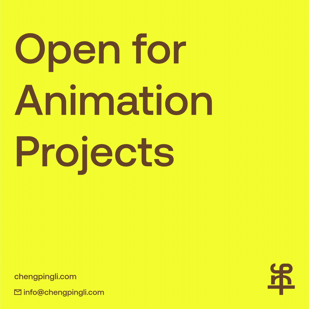
Feel free to say hi!
info@chengpingli.com
Location
Taipei, Taiwan
© 2025 Cheng Ping Li
